
I feel like I need to overhaul my logo design with something more modern and up-to-date. A perfect excuse to get to know Hexels and get out of my 3d confort zone a bit. I've dabbled in logo design in the past but never quite enough to have something worthy to post online. So bear with me as I try and redesign my logo with very little experience or skill in logo design!
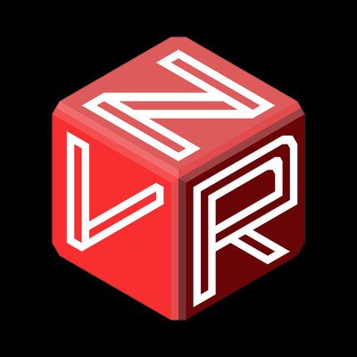
Started off with my old logo which I sketched on a napkin back in high school. Serif fonts were big back then! I put together my initials (V, R and N) and got my own sweet looking logo! (R comes from Razvan if you need ask!)
A while back when I started my Artstation page I decided that I will make it 3d and use it to brand my work. Here it is, in all of its Marmoset Toolbag rendered shiny-ness!
Needless to say it looks a bit dated so I decided to do a new one!
First up was a simple 3d cube with the initials on it. Looks a bit "youtube-ish" and you can't really tell if that top letter is an N or a Z so I had to sideline it for the moment. Learned how to use all the grid options in Hexels to paint 3d-looking stuff in the end, so that's a plus!
Back to the old drawing board. This time, the trusty math notebook. I wanted to get away from Hexel's "trixel" grid and think freehand.
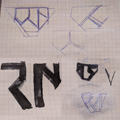
I ended up taking inspiration from Artstation's logo by flipping it to get a V-looking shape and trying to integrate the R and the N whilst keeping lines paralel. The V ended up being defined by the overall shape of the logo and the R and N and suggested by the cuts together with the negative space around the "V".
The orange is the same color Maya uses for their polygon commands shelf buttons. I chose it because it directly links my portfolio to the thing I do best: 3d modeling with polygons in Maya and looks like a sci-fi technical utility icon, again something that's closely related to my hard-surface inclination.

Looking at this first draft, somehow the top corners did not look right. Although they help the general "V-ness" of the shape, they added a bit too much "top weight" to the logo by not being parallel to anything else so I had to revert to something that looks a bit more like the Artstation logo that I would have hoped.

It was at this point that it hit me: "HALF LIFE 3 CONFIRMED!" as it looks too much like Valve's lambda symbol. Since the R is not that easy to make out, I did a bit more cutting to get this shape. As a byproduct, there's a nice hex there that breaks up the symmetry of the whole shape. There's good and bad with that but at least the reversed lambda symbol is not that obvious anymore.

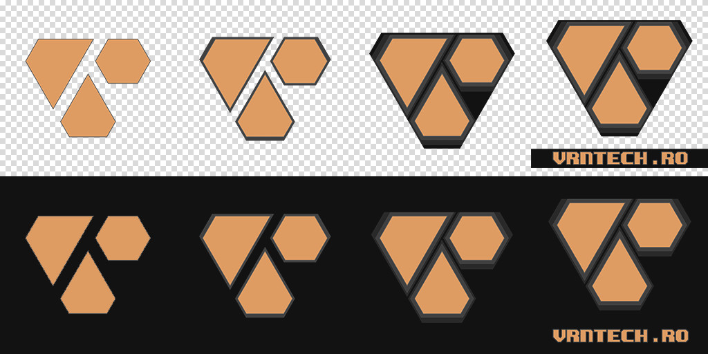
I settled on this as the final shape. Can't see the V, R, N letters? Here's a basic animation. Again in Hexels and with some sweet RGB over-the-top glowing bits.

Lastly, some variations. These will be used in various contexts depending on the size of the image, both as logos or as icons.
That's about it, at the moment I'm pretty happy with how it turned out. I'll give it a rest over the weekend and look at it again with fresh eyes on Monday. If I still think it's ok, I'll go through my portfolio and update all the images to contain the new logo.
Last but not least , if you have any comments, suggestions or critiques on this logo I'd be happy to hear them, I'm eager to up my game in logo design!