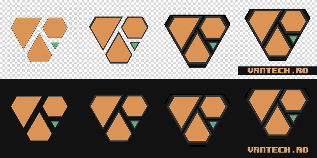
Last time I posted about creating a new logo and after some online discussions with some of my more graphic design savvy friends, I ended up doing some minor alterations. I added the small triangle to simplify the silhouette while helping with identifying the initials contained within the logo. That green is Maya's UV icon green btw!
Over the last couple of weeks I've also been working to freshen up the portfolio with some more up-to date renders and more consistent thumbnails. Each project now has icons in the thumbnail to help identify the primary software used.
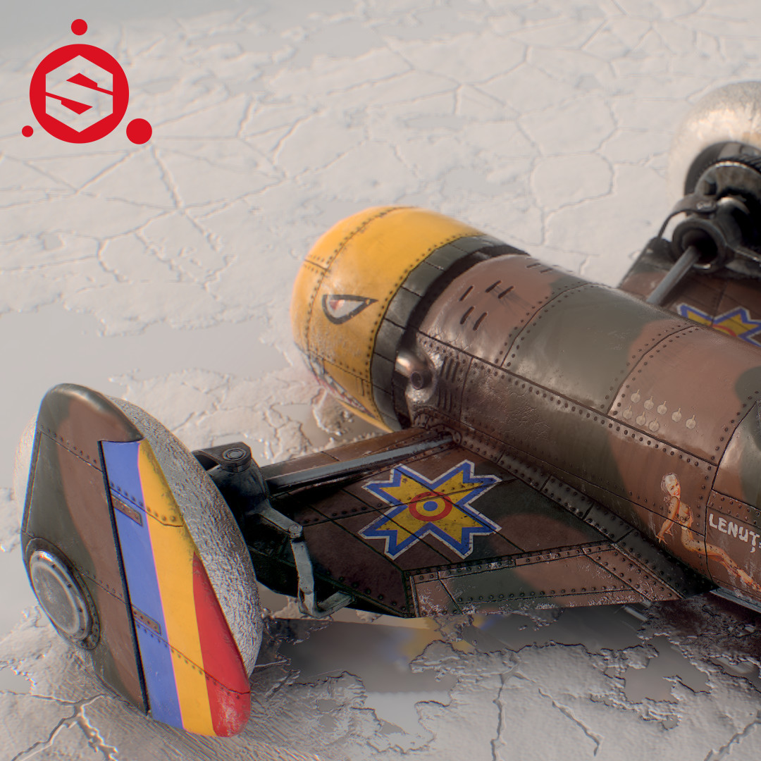
Most important updates are to the IAR-80 inspired "Planerod" which got upgraded big time. There are UV improvements, new bakes, new lines and rivets as well as more surface details in the form of the usual panel waviness you see on hand built airplanes. Also there's a new Romanian Royal Air Force inspired paint job with one totally-non-period correct pinup and some other easter eggs. It's a celebration of the centenary of the Great Union between Transylvania and Romania which took place on the 1st of December 1918.
This one also got the same salt flat texture I used in my Scott Robertson truck. Since that's a substance file, I only needed to plug in a new height map for the tire tracks and voila!
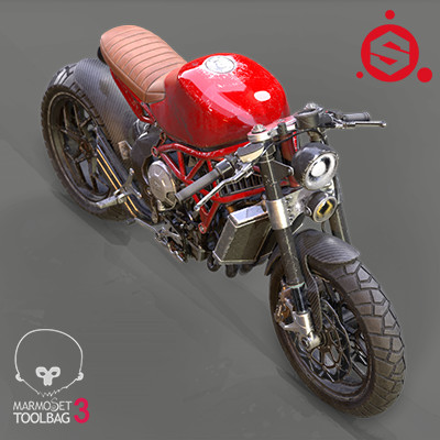
Also updated is the MV Agusta Brutale Cafe Racer which got some more subtle textures and improved renders with refraction and GI.
Some of my old works got improved renders as well. You can check them out at the links below:

